


Sustainable and Integrated Mobility
DURATION
8 weeks
LOCATION
Portugal + European Markets
CLIENT
Via Verde
TOOLS



Figma, Miro, Google Sheets, Useberry
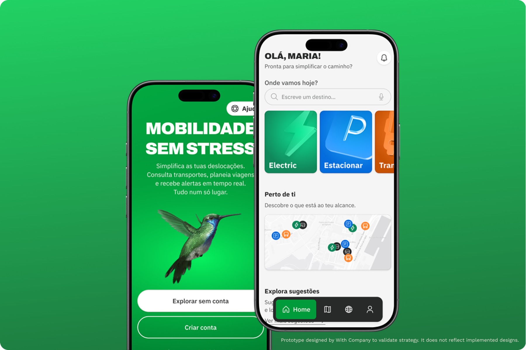
Via Verde and its newly launched app found themselves in a crucial period of transformation, evolving from a platform primarily aimed at urban car users to an inclusive app with national relevance and global aspirations.
Challenge
Via Verde, traditionally associated with toll payments and parking, faced the challenge of evolving into something more meaningful to its users — a true mobility partner, present across every mode of transport and every type of journey.
With users increasingly expecting products that reflect their values as much as their needs, aligning the app with modern sustainability demands became a critical step.
Outcome
We evaluated current products, identified patterns, listed opportunities, and designed a prototype that translated these needs. Then we re-tested, refined, and adjusted.
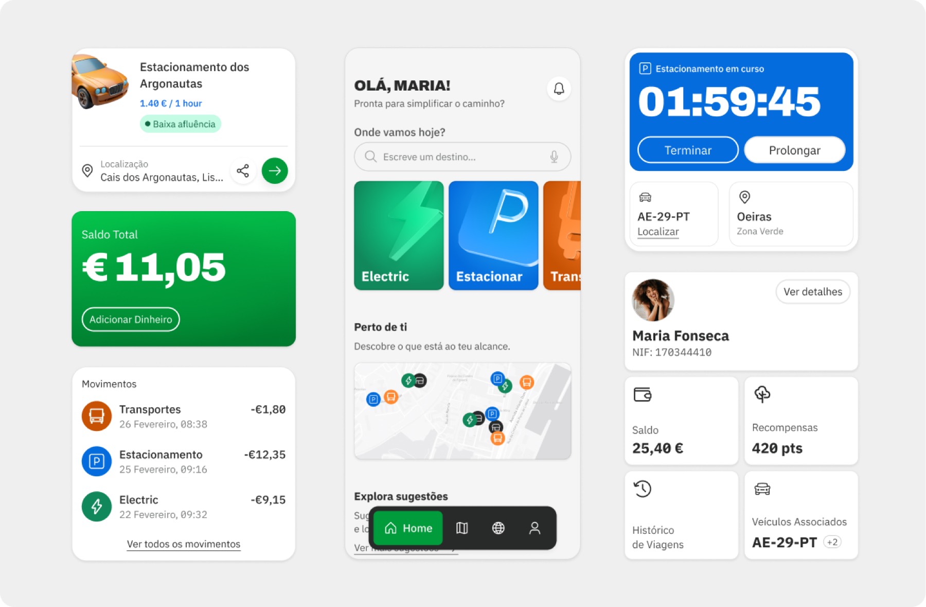
The result of that process: a seamless experience that simplifies urban and interurban travel by integrating payments, route planning, and complementary services.
Research
3
Lo-fi Prototypes
42
Quick Interviews
8
In-dept Interviews
3
Immersive Experiences
+20
Trends & Reports
30
User & Usability Tests
Users weren't overwhelmed by the number of features, but by the effort required to reach the ones they actually needed.
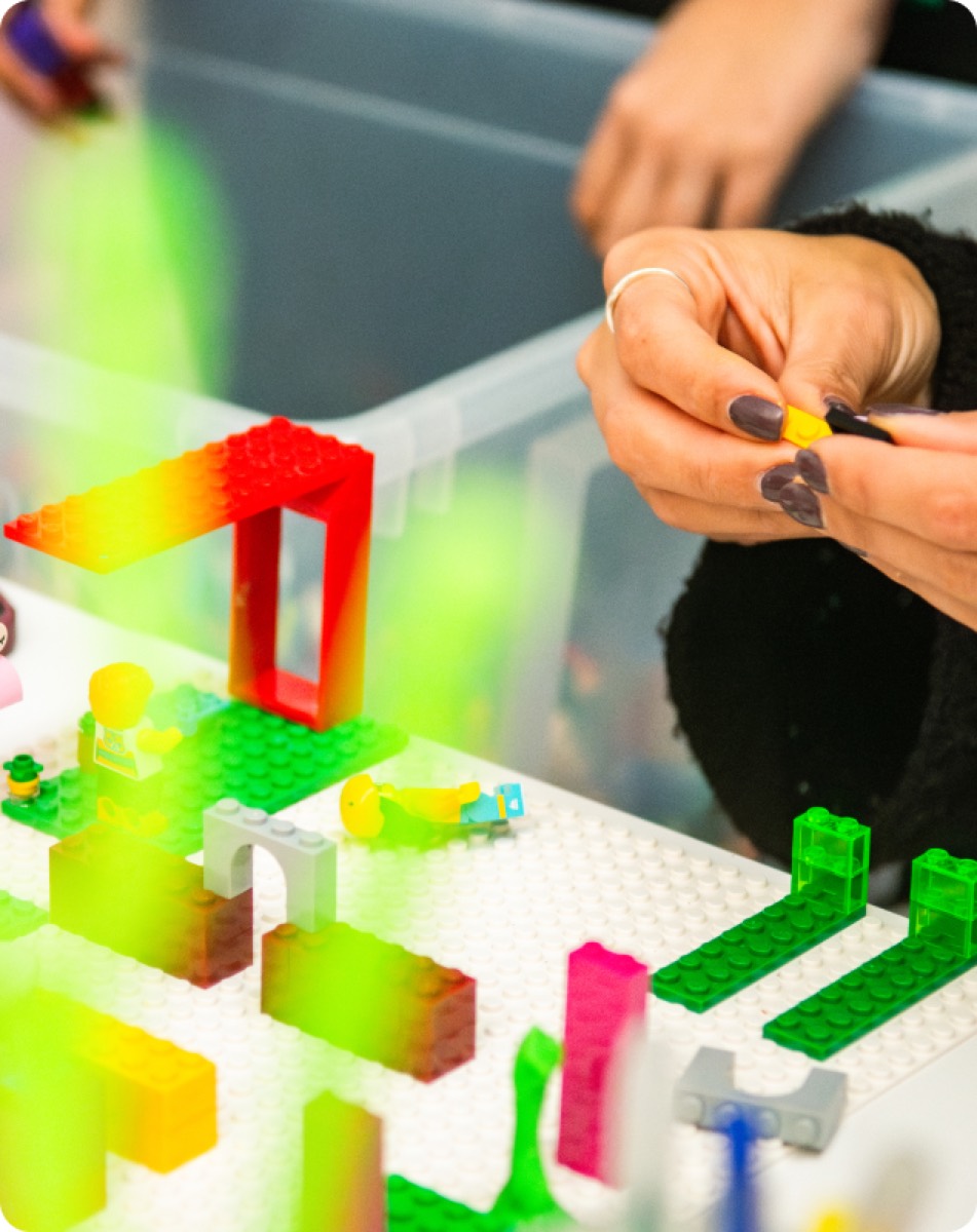
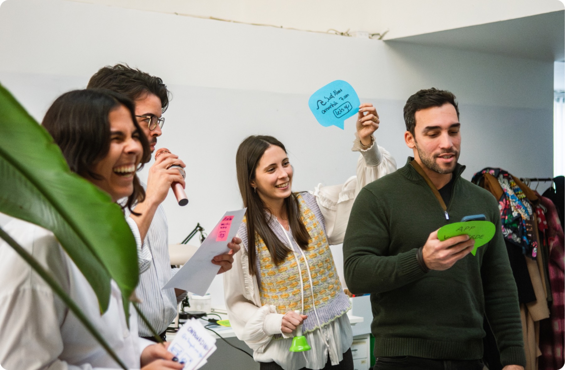
We started by listening to users. Through quick interviews and in-depth conversations, we mapped how users moved through the app: what they were trying to do, where they got stuck, and what they quietly gave up on. Lo-fi prototypes were tested early in the process, allowing us to surface assumptions and discard them quickly. We also ran immersive experiences and co-creation workshops to bring different perspectives into the room, and grounded everything in a thorough review of market trends and competitive references.
One pattern came through consistently: users weren’t overwhelmed by the number of features. They were overwhelmed by the effort required to reach the ones they actually needed. The mental load of navigating the app was higher than it should be, and that friction was quietly pushing people toward simpler, less capable alternatives.
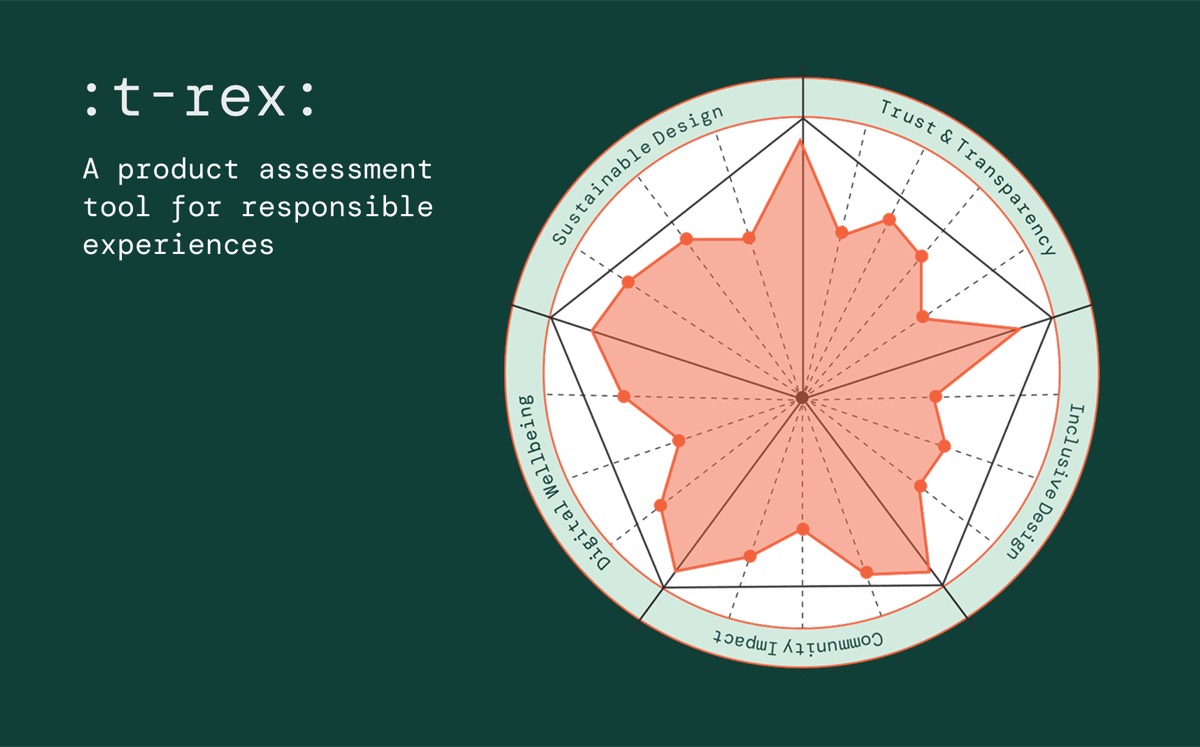
Product audit with :t-rex:
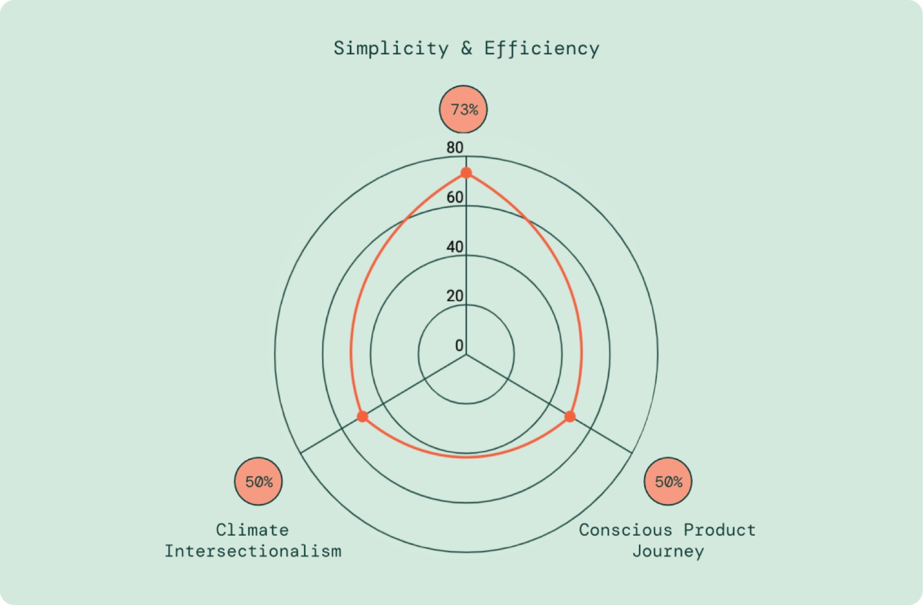
Alongside research, I conducted a sustainability analysis through :t-rex:, an intersectional research tool, against criteria that standard ux metrics don't capture. Three axes were applied: Simplicity & Efficiency, Conscious Product Journey, and Climate Intersectionalism. The assessment covered 36 parameters across more than 100 screens.
Simplicity & Efficiency scored 73%, reflecting adequate performance in typographic economy and colour usage, with no unnecessary media weight. Conscious Product Journey and Climate Intersectionalism both scored 50%.
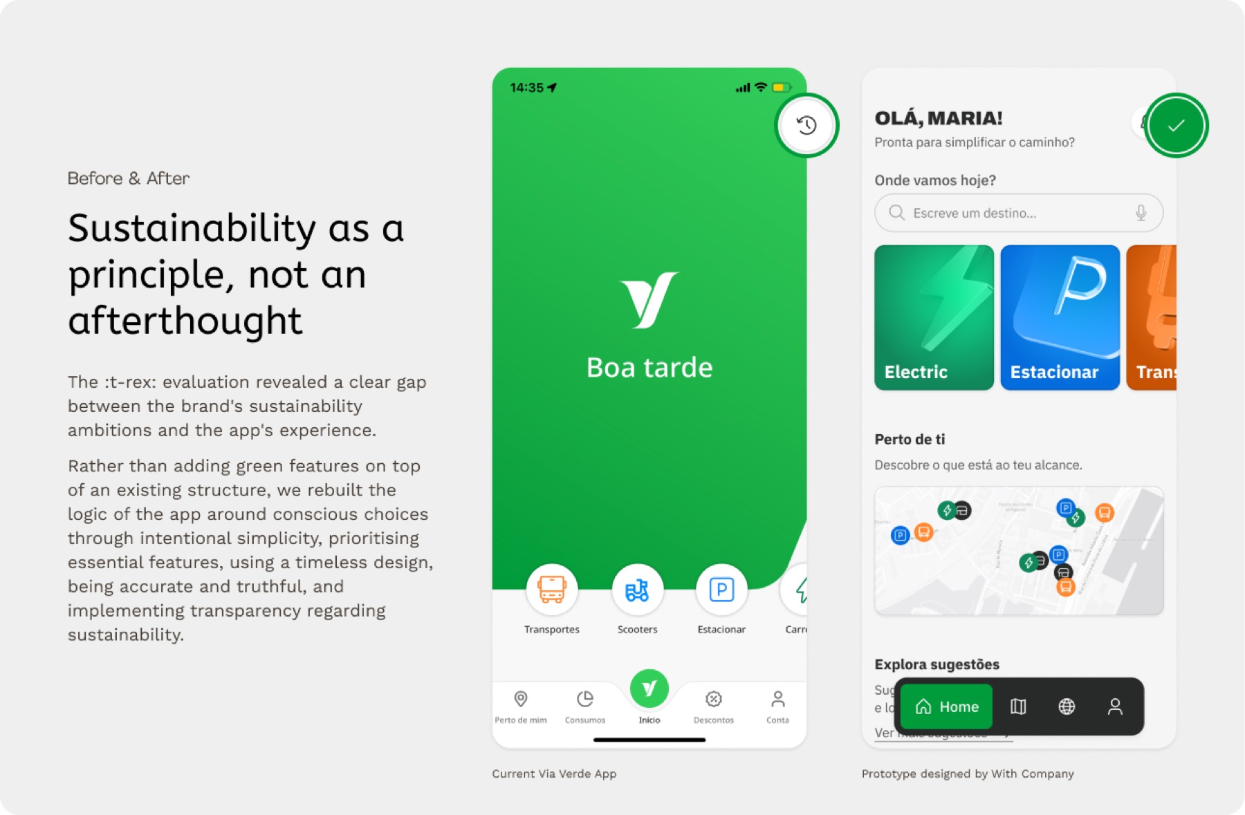
The app's services had no coherent connective logic. Features coexisted without forming a unified experience. The product's information architecture still assumed a primary user who owned a car and moved through an urban environment, despite the brand's stated ambition to serve a much wider population across a wider range of journeys.
The disconnect ran deeper than surface treatment. Those assumptions were structural. Extending the existing architecture incrementally wouldn't serve the brand's actual direction. The design response would need to reconsider who the product was built for.
Results
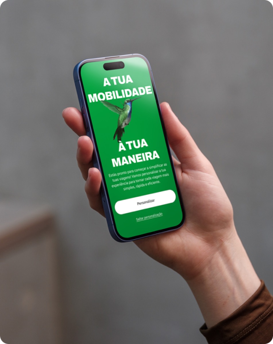
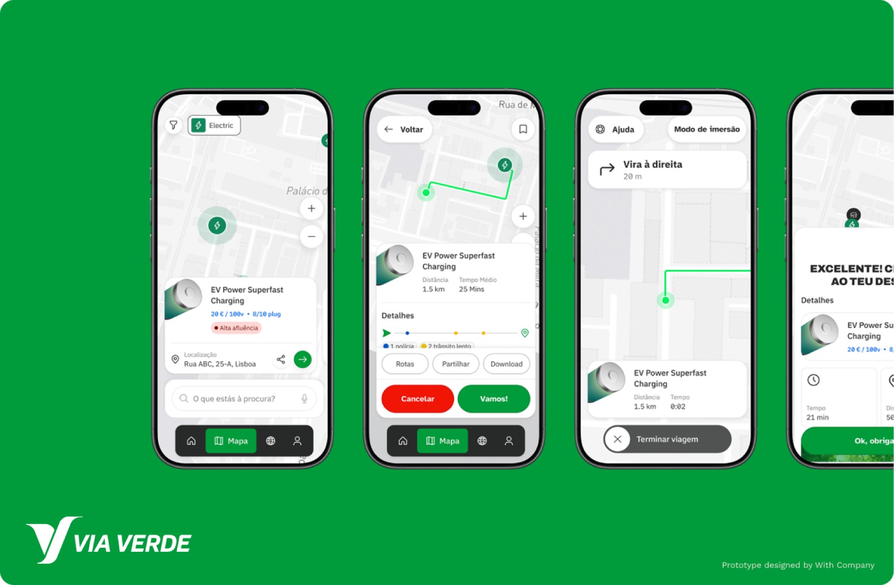
The prototype was built to make the strategic vision tangible — translating recommendations into something you can see, click through, and react to. We simplified navigation flows, introduced intent-driven interfaces that surface the right services at the right moment, and restructured key journeys to reduce the effort required to complete everyday tasks. Rather than a set of abstract principles, the prototype gives stakeholders a concrete reference point: a shared picture of what the product can become and the direction all subsequent decisions should move toward.
The journey toward becoming a truly integrated mobility platform is ongoing, but the foundation is now in place. Via Verde enters its next chapter with a clear vision, a responsible design framework to guide its decisions, and a product that is beginning to reflect what the brand has always stood for. By 2035, the goal is a mobility ecosystem that helps shape how people move through the world.
Related content
With Company
t-rex: — An intersectional research tool